Chapter 10: You try it: Putting it all together
How much have you learned? Let’s try it all out with an exercise all on your own.
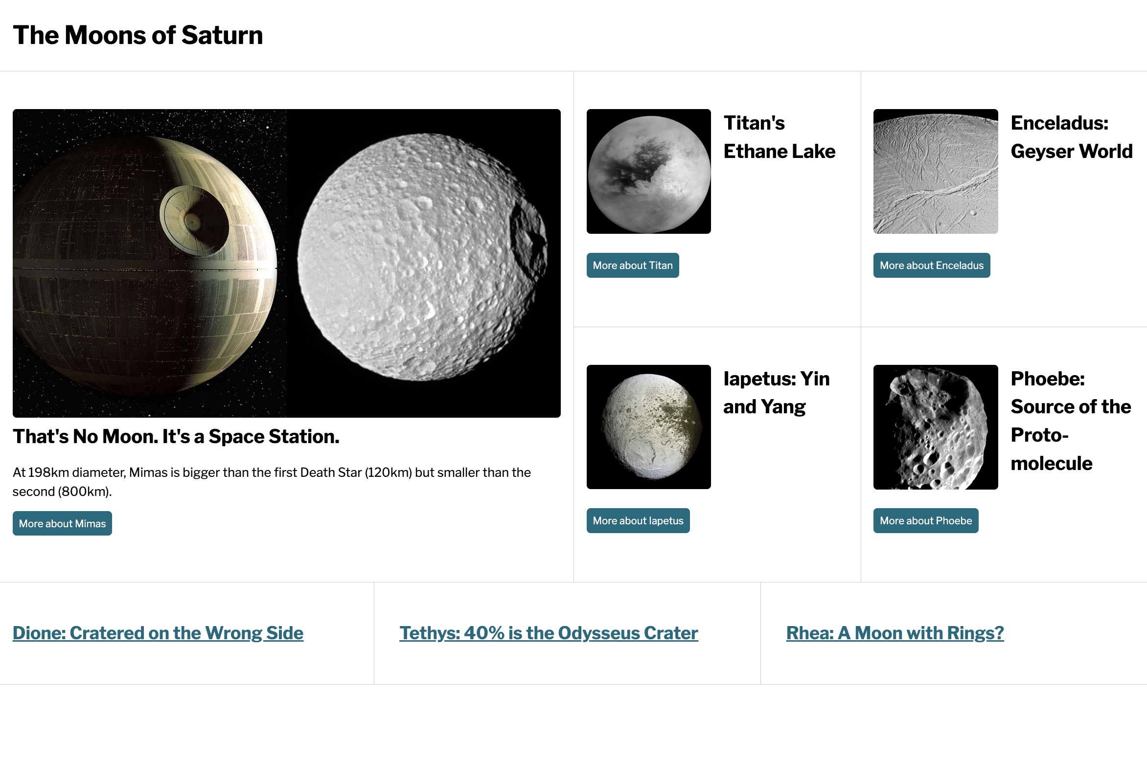
Lay out the page using Grid, based on all of the things you've learned so far:
- intrinsic and extrinsic grid
- number, span, area syntax
- grid-template-columns and grid-template-rows
- minmax()
- subgrid
- media queries
Media queries will happen at 500px, 750px, 875px, 1000px. Use a mobile-first approach. Basic formatting will not need to be changed.
Recommended approach:
- Review the HTML. Review the designs below.
- Start with the mobile layout. Consider how you might lay out this page since you have some cards with images and some titles without. There's no layout for the page itself, but there is a layout for the cards.
- Once the mobile design is stable, write a media query for 500px and up. Here you'll need Grid to lay out cards on the page and Grid to complete layouts within the cards.
- Repeat the process at 750px. You may find around 875px that you'll want to make a few minor tweaks, but no major changes to the layout.
- Finally write a media query for over 1000px.
- HINT: You may want to consider the titles as a separate layout unit from the cards with images.
Less than 500px

500-749px

750-999px
You may find that you want another media query around 875px for a few small modifications to the layout.
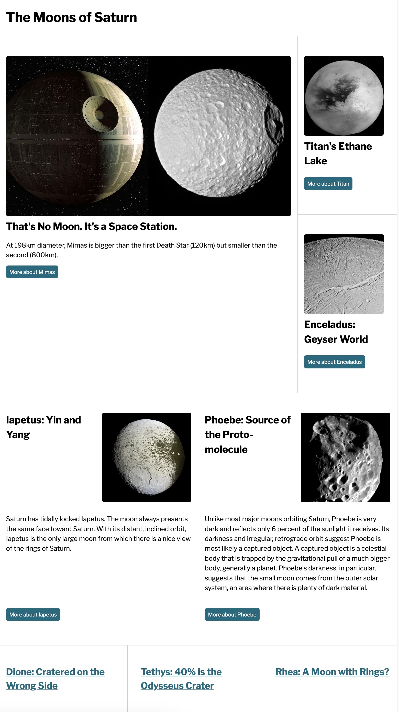
1000px and up