Grid & Flexbox v3

Chapter 7: Working with mobile-first layouts

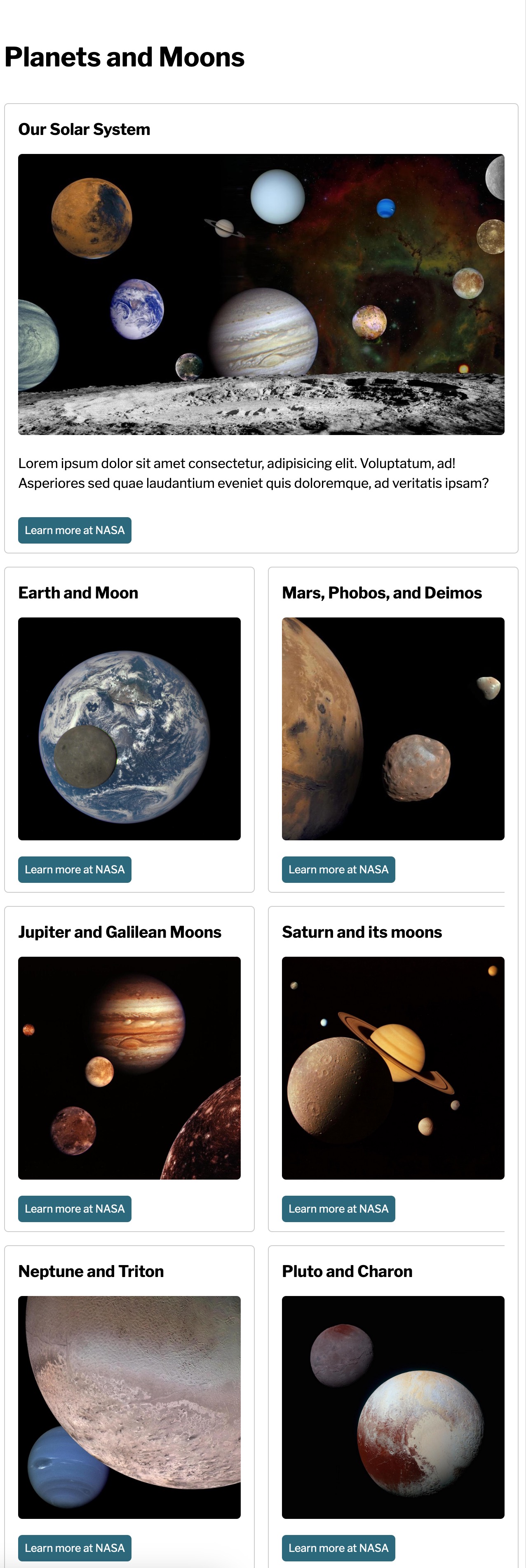
In this chapter, we'll be building some layouts for a series of cards. One card is featured, while the other cards get a similar treatment. Review the designs below to learn what we will code.

Beginning CodePen

Less than 500px

Stacked cards for mobile layout.

500-699px

Featured card spans 2 columns, other cards form 2 columns underneath.

700-899px

Featured card spans 3 columns, other cards form 3 columns underneath.

900px and up

Desktop layout has the featured card spanning 3 columns and 2 rows. A 4th column has 2 cards stacked on top of each other and next to the featured image. Remaining 4 cards are lined up underneath as 4 columns.

We will write these 4 layouts using min-width media queries at 500px, 700px, and 900px.

Ending CodePen